Ahhh – now for the Google Reader exodus I guess.
I have been so faithful to Google Reader. Even before they integrated Reader with Apps for those managing our own domains, I still used my Reader account with my old Gmail address – logging in and out constantly. That is how much I enjoyed the product. I used to be very loyal to Bloglines. I had also given Netvibes a whirl. But Reader was the only thing that ‘stuck’.
My complaints are –
– I love a clean interface but the latest roll out is ridiculous. Using valuable screen real estate for white space within a resource that is used purely for reading does not make sense.
– White, white, WHITE! I am going to have to keep my sunglasses at my desk as it is just too bright to have that much white space screaming at me. Especially first thing in the morning!
– It is s-l-o-w – clicking ‘mark all as read’ does not clear the backlog in an instant, scrolling has gone from almost instantaneous to a 1-2 second delay. It may not seem like a lot but when you are reading hundreds of headlines and article previews at a time it is very annoying.
– It seems harder and/or slower to scroll through the entries on a whole.
– The headlines are too big and take up too much space.
– The folders are clunky and for some reason and it takes multiple attempts to clear/open/use them.
– It is now working more intrinsically with Google Plus. I just deleted that waste-of-space account last week. It was even more useless than Buzz and Wave. I kept it long enough and I don’t really want it back.
I DO NOT UNDERSTAND WHY I NEED ALL OF THIS SPACE?!

Now, I never used it for the social features so the issue with the lack of sharing isn’t really bothering me but it is bothering a lot of other people. Have a look at the Google Reader ‘Something is Broken’ forum and you’ll see what I mean.
The usability of something that was so basic has been totally ruined by trying to ‘dumb it down’ even more.
ALSO MISSING –

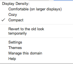
In the settings area of the new Gmail and new Google Docs there is an option to change the layout betwen comfortable, cozy and compact yet why did they decide not to add this to Reader? I think a compact view would solve a lot of the issues with space between entries. Why would they not have the same settings?! Baffling!! Make the headlines bold instead gigantic and they would be on to something.
Alternatives to Google Reader?
This guy says there are basically none and I feel this is correct seeing as I’ve already been there, done that with Netvibes and Bloglines. Plus, to be honest I don’t want yet another website I have to log in to. I have really enjoyed having my own domain email based on Google Apps and having all of the feature be made available without having to log in and out of different services.
I’ll be sure to report back on any other Readers I try but right now I only wish iCloud included a RSS Reader.